
Styling a card using CSS 🃏
Learn about margin, border-radius, padding and styling images and many more.

I am a web developer who likes to share his learning with cool people like you.
Today we are going to style this card using CSS.

First of all, a mini mind map of what we will be doing to style this card is
we need a container for the card, which has a nice
border-radiusandbox-shadow.Then inside the container, we have a circular picture ( because we have made it's
border-radius50% ).After that, we have a heading.
Then a paragraph for description ( its text is aligned in the center ).
In last, we have a nice medium-sized button with a black background and white text.
Writing the code [HTML] for the card
Create an HTML file for the webpage and write the content for the card. or say make the skeleton of the card.
<div class="card-container">
            <img src="https://img.freepik.com/free-photo/landscape-shot-beautiful-cholatse-mountains-body-water-khumbu-nepal_181624-24825.jpg?size=626&ext=jpg"
                alt="landscape">
            <div class="card-content">
                <h2>Beautiful Landscape</h2>
                <p>Lorem ipsum dolor sit amet consectetur
                        adipisicing elit. Quisquam, quod.</p>
                <a href="#">Read More</a>
            </div>
        </div>
Here, I have created the card container using div tag and gave it the class of card-container .
Then used img tag to show an image from an external source, using its URL.
Then I created a div with a class of card-content that would contain the content of the card like a heading, description, and a link.
Writing CSS for the Card --> card-Container
First of all, we will style the card container, by selecting the div element with its class name
.card-container {
  width: 300px;
  height: 350px;
  background-color: #fff;
  border-radius: 10px;
  box-shadow: 0 0 10px rgba(0, 0, 0, 0.2);
  margin: 20px;
  padding: 20px;
  text-align: center;
}
Every property is self-explanatory.
widthsets the width of the card,heightsets the height of the card,background-colorsets the background of the card (#fffmeans white in hex ),border-radiusmakes all four corners of the card a bit circular,box-shadowgives the shadow to the card,marginsets the spacing outside of the card,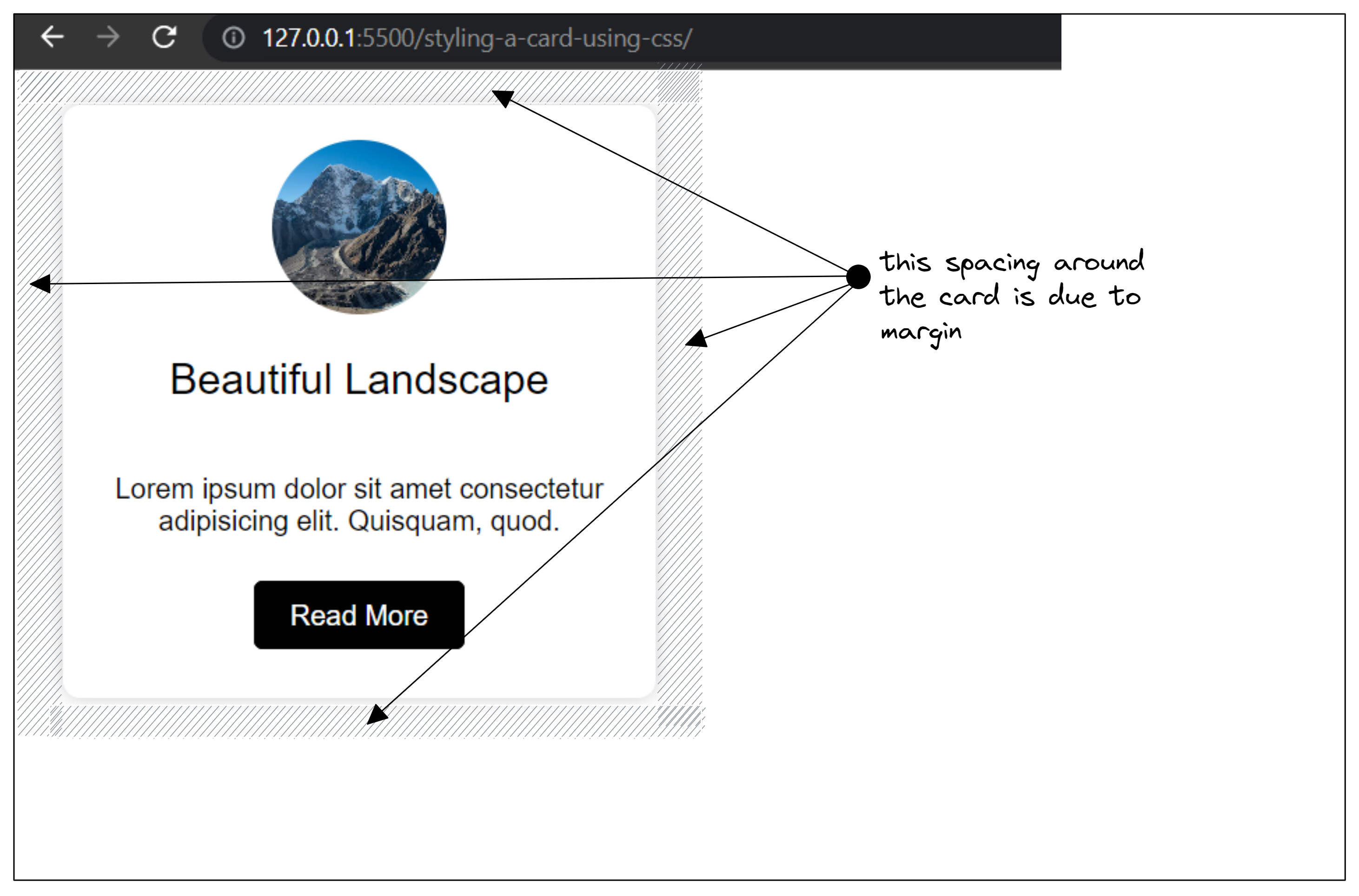
paddingsets the spacing inside the card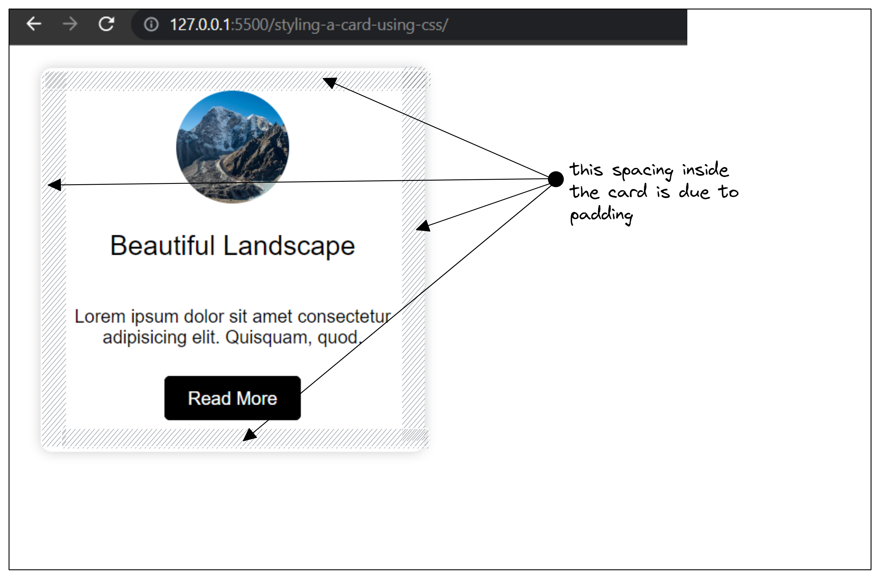
text-alignproperty sets the alignment of texts inside the card. It also sets the alignment of the text of the inner children.
Styling the picture of the card
We will select the img tag by descendant selector because img tag is a descendant of .card-container.
.card-container img {
  width: 100px;
  height: 100px;
  border-radius: 50%;
  object-fit: cover;
}
Explanation of the above code:
widthas usual sets the width of the element ( in this case sets the width of img )heightsame aswidth, it sets the height of the elementborder-radiusalso takes the value in percentage, and makes the element circular ( if the element is square means its width is equal to its height ).object-fitproperty resizes and crops the image to fit the dimensions given to it, withoutcovervalue, the image will get stretched because the actual image is not a square.
Giving spacing above and below p tag,
.card-container p {
  padding-top: 20px;
  padding-bottom: 20px;
}
Here we selected p tag and gave spacing using padding-top and padding-bottom property. You can also use margin-top and margin-bottom for the same task.
Let's style our Big Black Button
.card-container a {
  text-decoration: none;
  color: #fff;
  background-color: #000;
  border: 1px solid #000;
  padding: 10px 20px;
  border-radius: 5px;
}
Here, I have used an anchor tag not a button.
So, we will make the anchor tag look like a button.
An anchor tag already comes with some styling, its color is blue and it has an underline.
text-decorationis given the value ofnoneto make the underline disappear.colorsets the color of the text.background-colorsets the background of the button.bordertakes three value values,1pxdefines the thickness of the border,solidmeans the border line will be a continuous line,#000defines the color of the border.paddingdefines the spacing inside the button, first10pxsets the upper and bottom padding, second20pxsets the left and right padding.border-radiusmakes the corner of the button curvy.
Adding Hover Effect to the Button
.card-container a:hover {
  background-color: #fff;
  color: #000;
}
When you hover over ( take the cursor over the element) any element, CSS senses that event and applies the styling if it is defined on that element.
So we define the styling on hover of any element using :hover selector.
In our case, when an element is hovered, its text color becomes black and the background becomes white.
Read more about these properties on W3Schools
-
If you are facing difficulty in understanding any property, type the name of the property in the google search box 👍.
Source Codes 💠
Click here to download the source code of this blog.
Here is the source code of this blog on GitHub.
Live Preview of the codes in this blog.


